
PLUS Tutoring Website
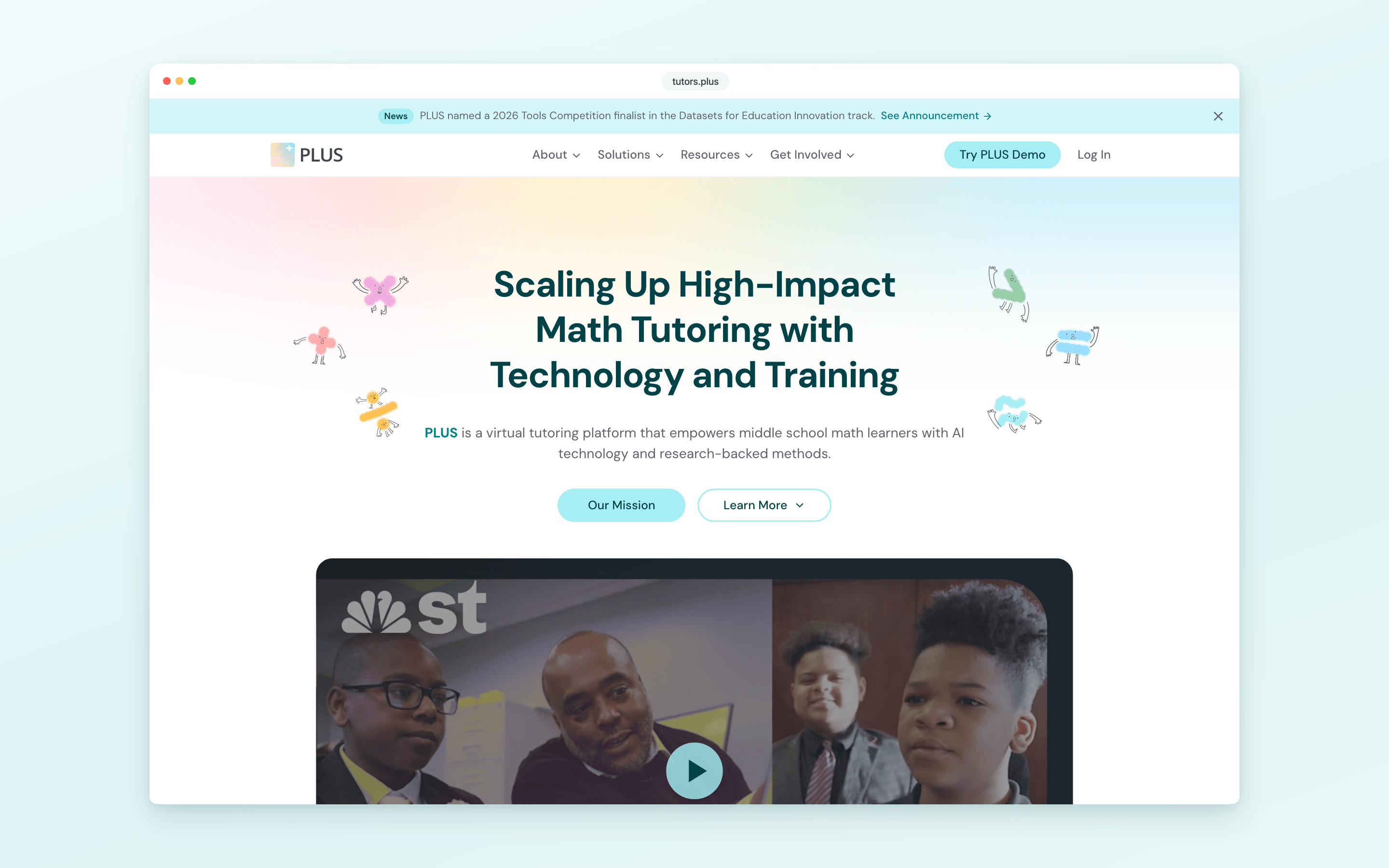
Overview
PLUS (Personalized Learning Squared) is a virtual tutoring platform from Carnegie Mellon University: trained college tutors, AI-assisted tools, and research-backed methods for middle school math. 8900+ students across 25+ schools, tutored by 900+ tutors so far. The website is how schools, tutors, and researchers first meet the program.
I own the site end to end: information architecture, visual design, the design system, the Next.js build, and the Notion CMS the team publishes through.
Visit the Live SiteRole
Website Designer & Developer
Responsibilities
Information architecture, visual design, design system, front-end build, CMS pipeline
Tools
Figma, Next.js, Tailwind CSS, Storybook, Notion
Timeline
Jan 2026 to Present
The Challenge
One site had to speak to three different readers, a school, a college student, and a learning scientist, and stay updatable by the people who run the program.
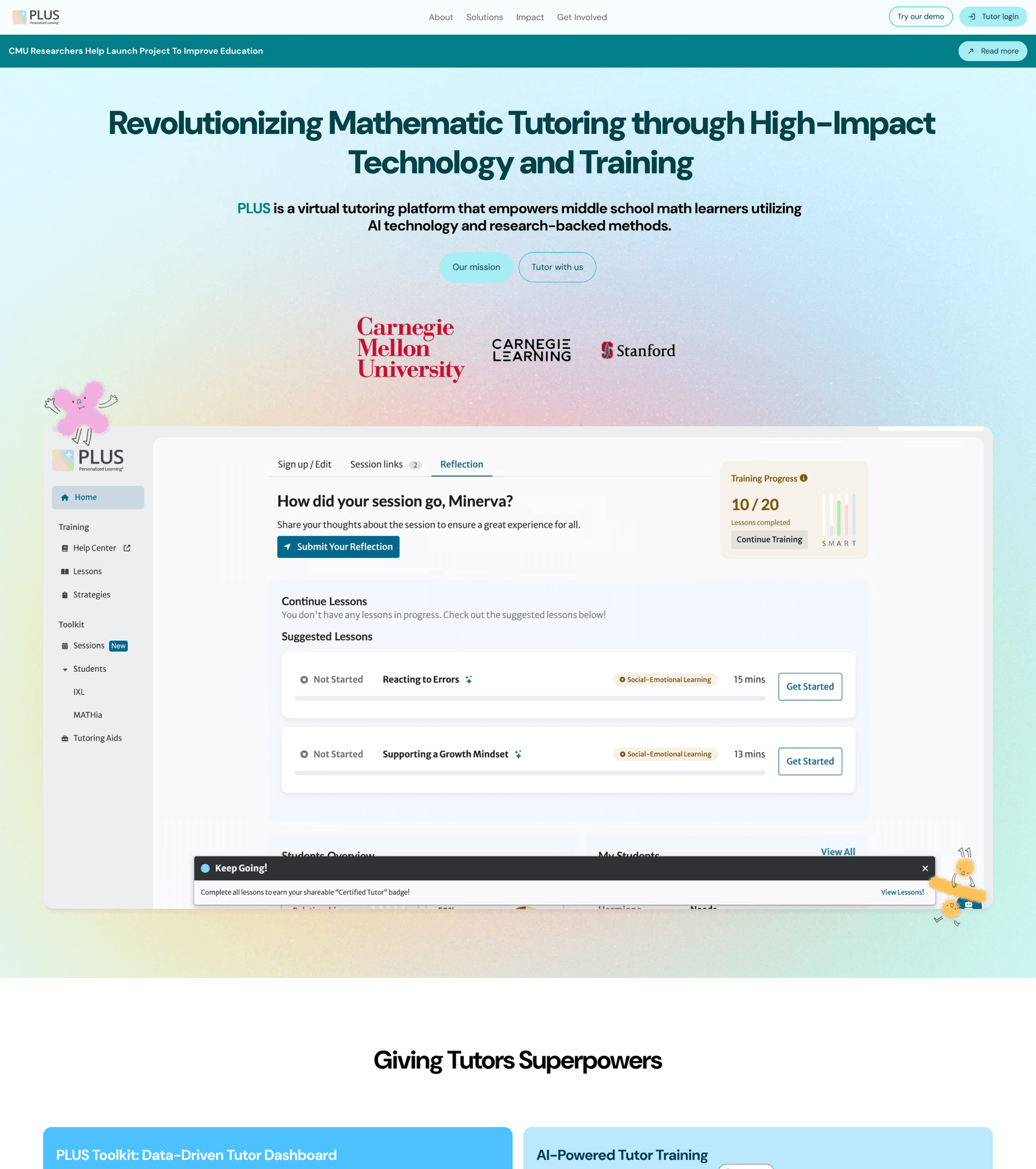
PLUS had outgrown its website. Schools deciding on a partnership, students deciding whether to tutor, and researchers evaluating the method all landed on the same long homepage, and every content change, a new story, a news post, a number, waited on a developer.
Where It Started
Information Architecture
The structural decision the whole redesign hangs on: a front door per audience, and a proof layer they all share.
The homepage stops trying to be the whole site. It makes the case fast, then routes each reader to a page built around their decision, and the evidence everyone needs lives once, in a shared layer, instead of being repeated on every page.
The Sitemap
The three front doors live under Solutions
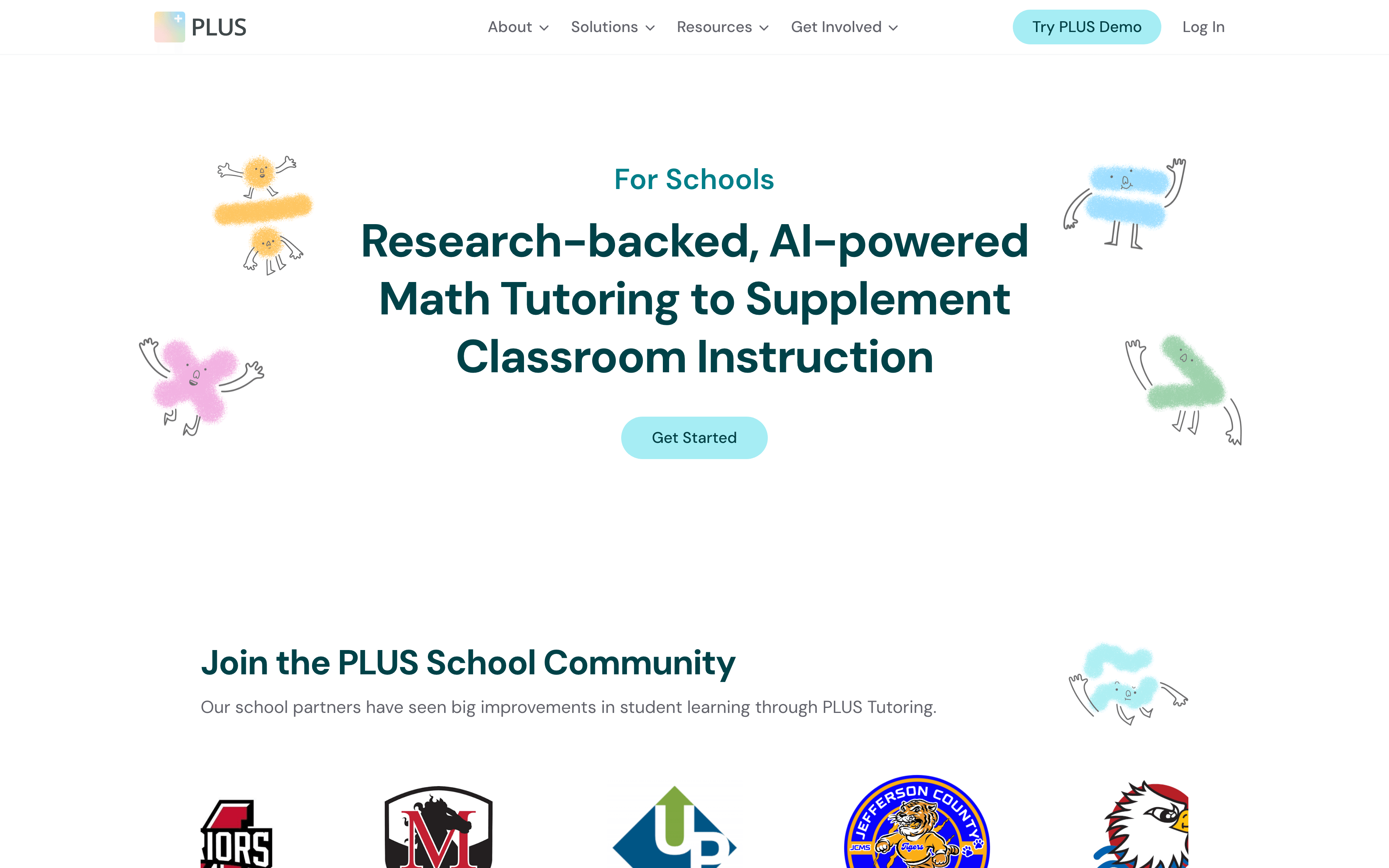
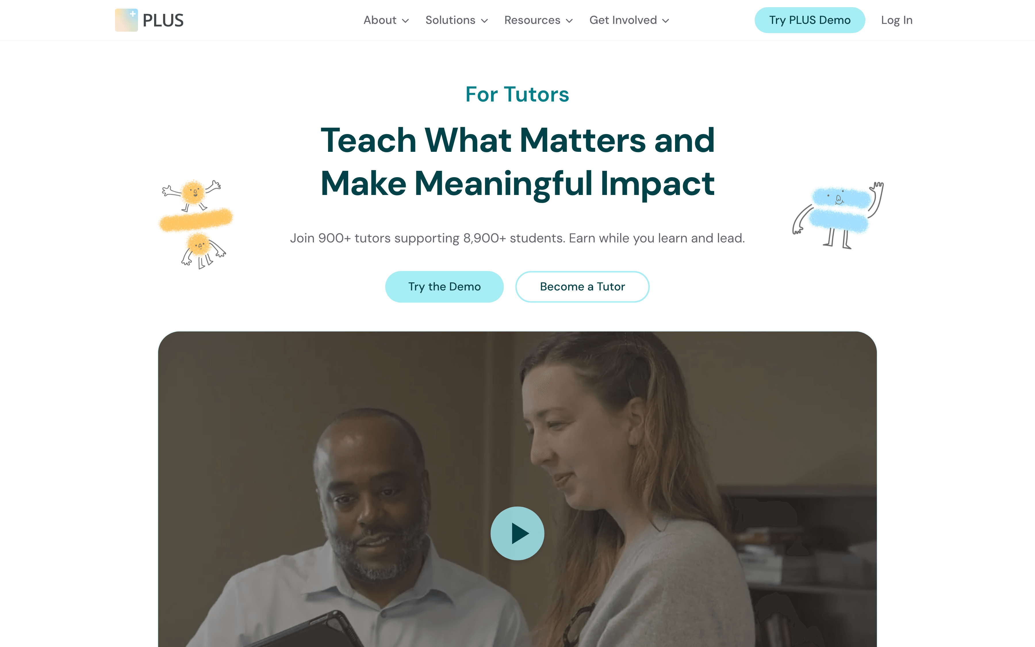
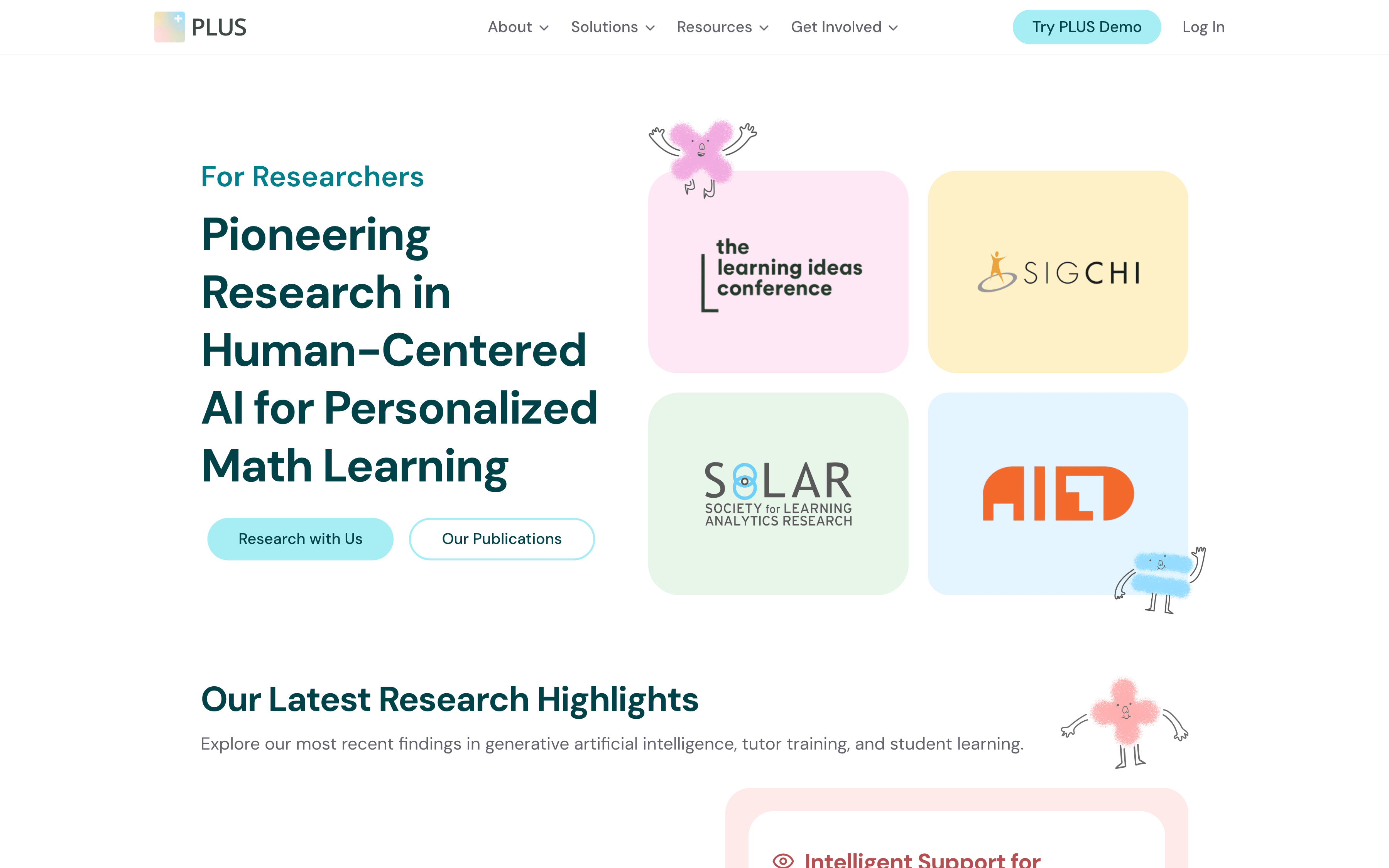
The three front doors live under Solutions, each speaking its audience's language: outcomes for schools, pay and growth for tutors, evidence for researchers. Around them, About and Resources carry the proof all three come looking for, and Get Involved catches the careers and partnership asks.
The Publishing System
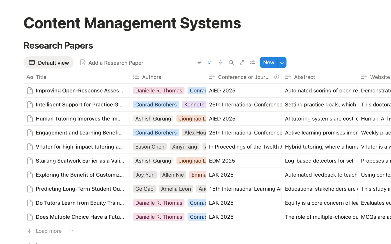
The CMS: databases the team edits in Notion
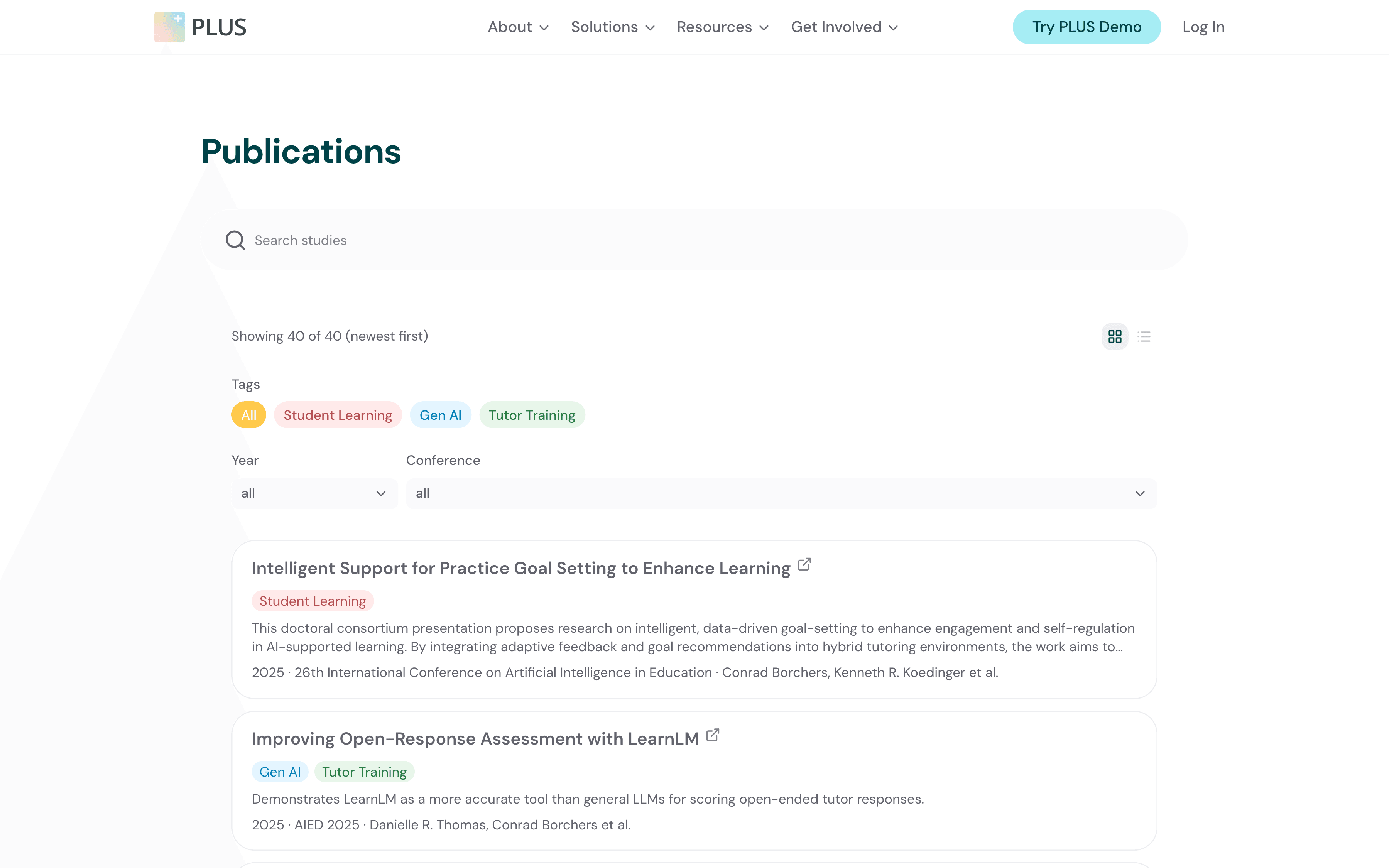
The same papers, live on the site
The second product is behind the scenes: a Notion CMS that powers the site's news, stories, team, and publications. Staff write in Notion, the site pulls it in, and publishing stopped being a developer task.
The Design System
Pages get assembled, not redesigned: tokens, components, and documentation came before any landing page.
The Brand Ramps
Six ramps, eleven steps each, verbatim from the codebase. Teal is the primary hue: the dot marks the light step the CTAs wear, with ink pulled from the dark end of the same ramp. The other five are accents, and every section fill on the site comes from their pastel steps, so no card ever leaves these six hues.
Components & Type
Components
One loud pill, one quiet one, chips on the teal ramp, and bento cards on the accent pastels. Radius rides the 10px token.
Type & Rhythm
Headlines in DM Sans
Body reads at 16, relaxed leading.
One family; hierarchy comes from weight and scale. Spacing keeps a fixed rhythm: page padding steps 16, 24, 32, and sections breathe at 32, 48, 64.
All of it is documented as it ships: the Storybook served beside the site holds 248 entries, tokens through full sections, so a new landing page is assembled from blocks that already passed review.
The Pages
Three front doors, one language.
In Motion
The Audience Pages
The Proof Layer
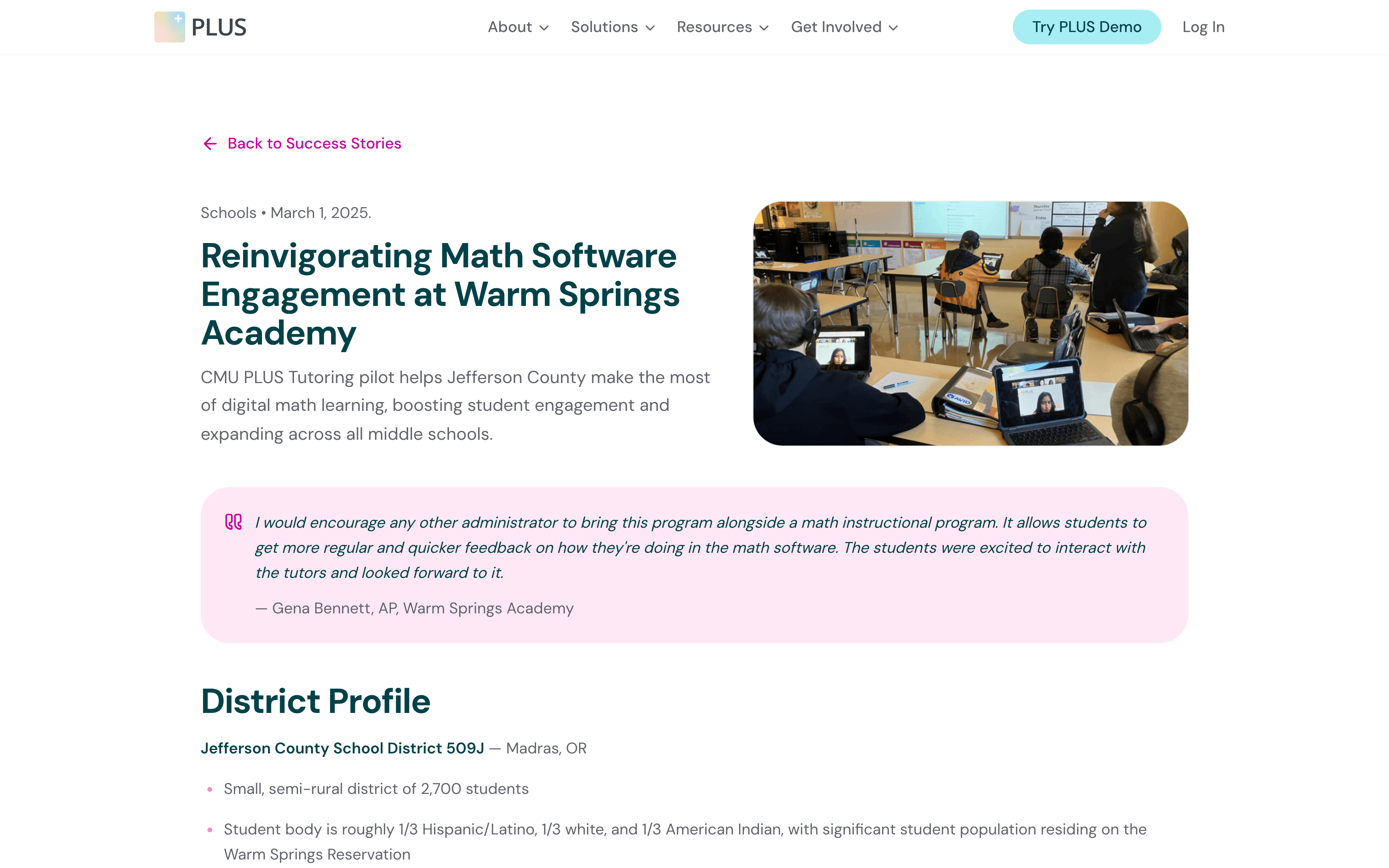
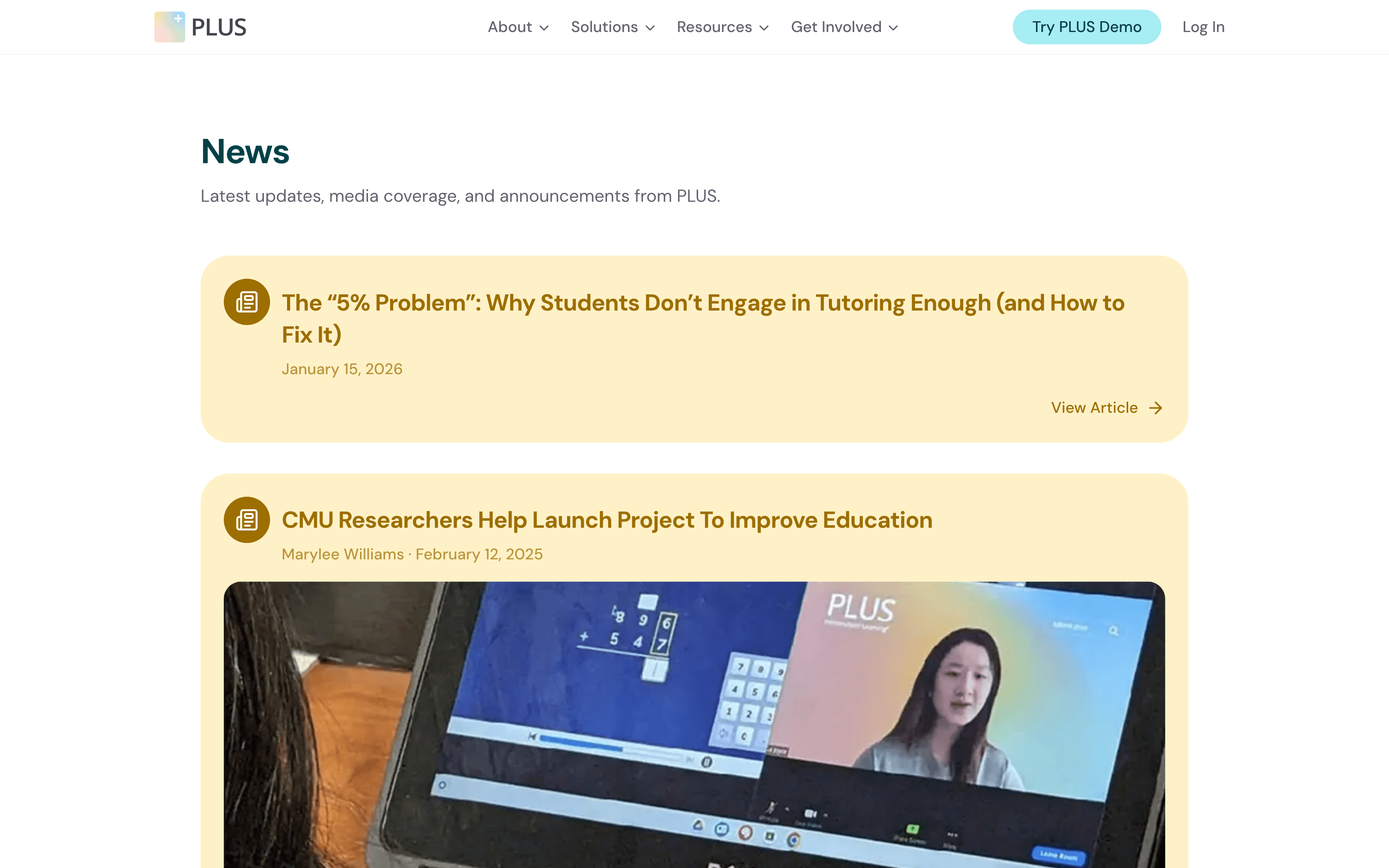
Testing the Architecture
The measure was communication, not aesthetics: the same four tasks on the old site and the redesign, testing whether each visitor could find what mattered to them.
The Usability Rounds
01
Say what PLUS does
02
Find how schools join PLUS
03
Find how to become a tutor
04
Find the published research
The four fixes below are what moved the numbers, and they are all the same move: shortening the distance between a visitor and the information they came for.
The Four Fixes
01
The homepage gets to the point
The old homepage tried to be the entire site, a product tour, impact, research, and testimonials in one scroll. The new one makes the case in one screen, then hands each visitor to the page built for them.
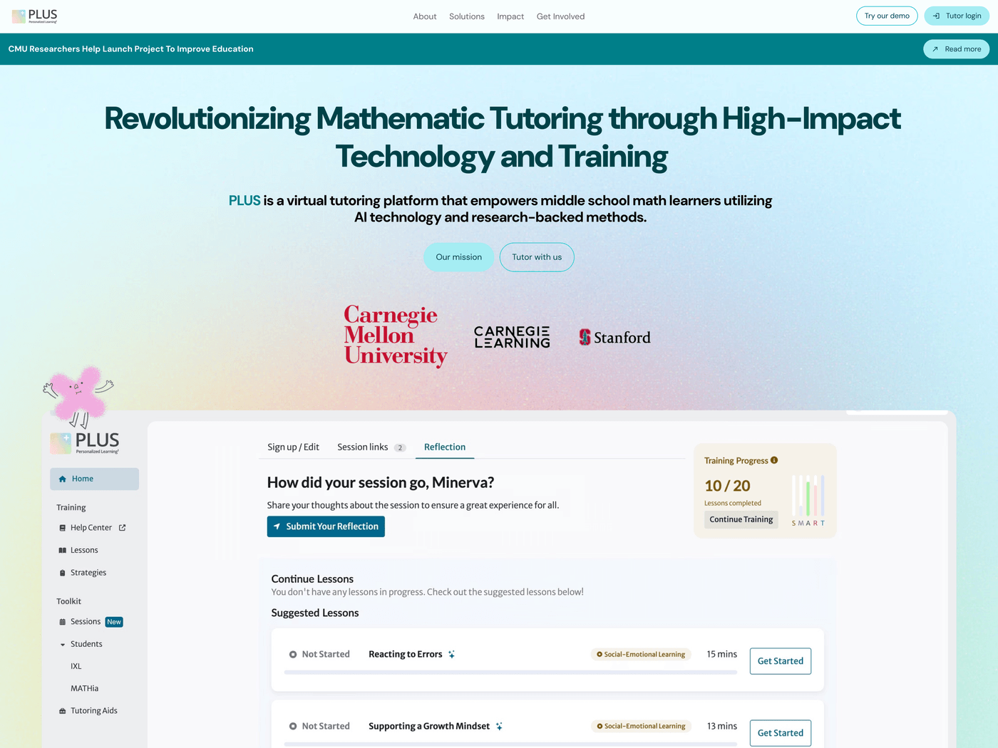
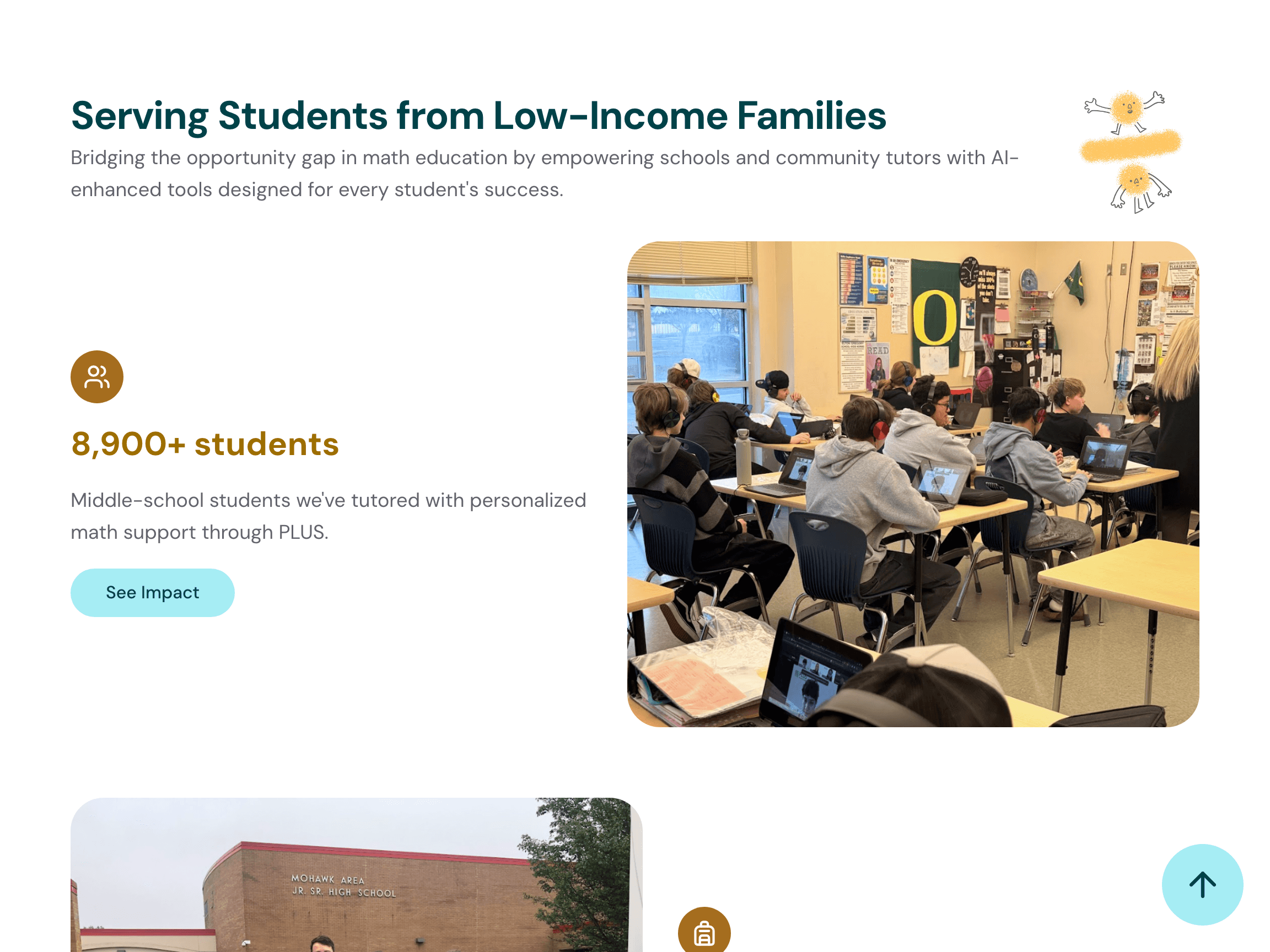
One page saying everything
Who it serves, at what scale
02
Schools get a straight answer
The schools pitch lived in a single card mid-scroll. Administrators wanted to know what a partnership looks like and how to start, and the old page answered neither directly. For Schools answers above the fold.
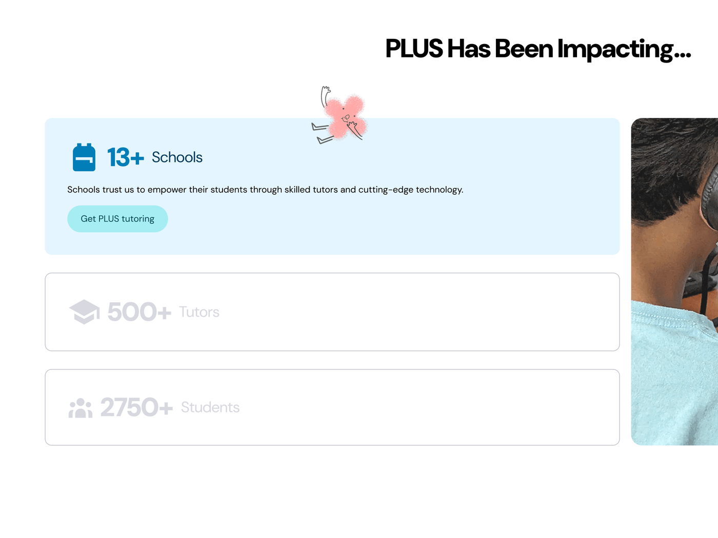
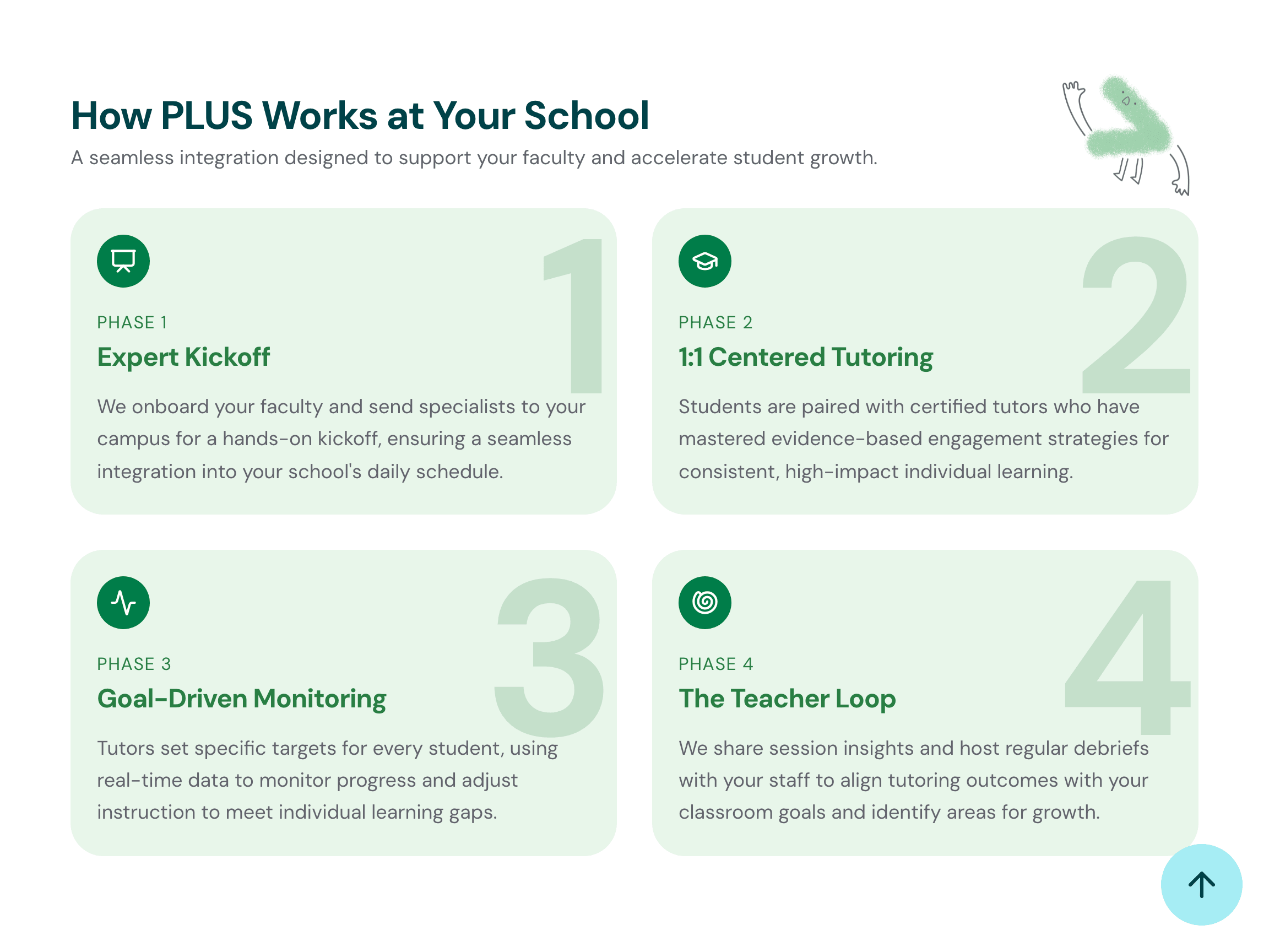
The pitch, buried mid-scroll
The partnership, step by step
03
The offer comes first
The old site showed tutors the toolkit but never the offer. For Tutors leads with pay, training, and certification, the questions college students actually ask before signing up.
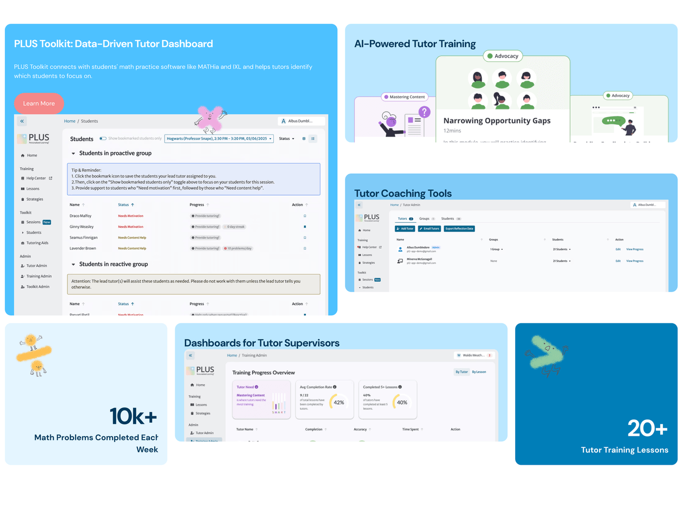
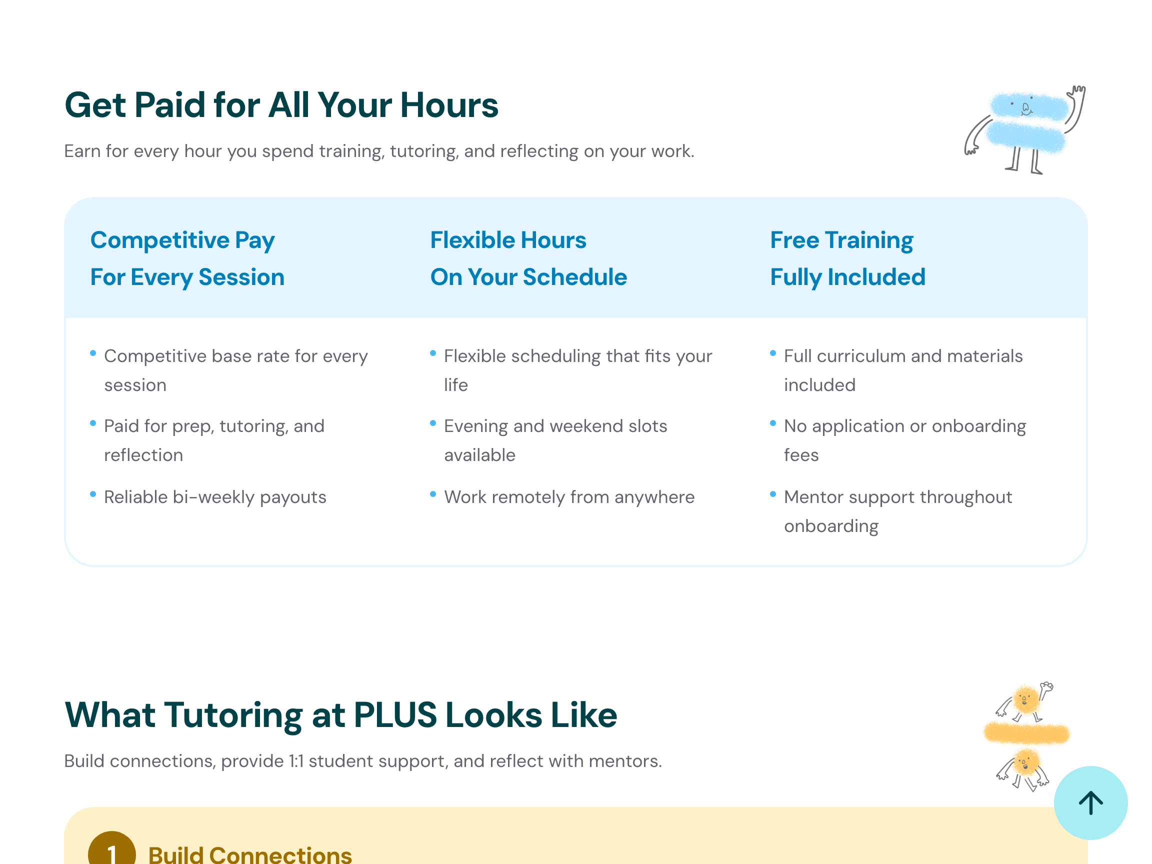
Features, but no offer
The offer: pay, hours, growth
04
The research moves up
Thirty published papers sat in a strip near the footer, the wrong floor for the program's strongest credential. Research gets its own page, with the publication index behind it.
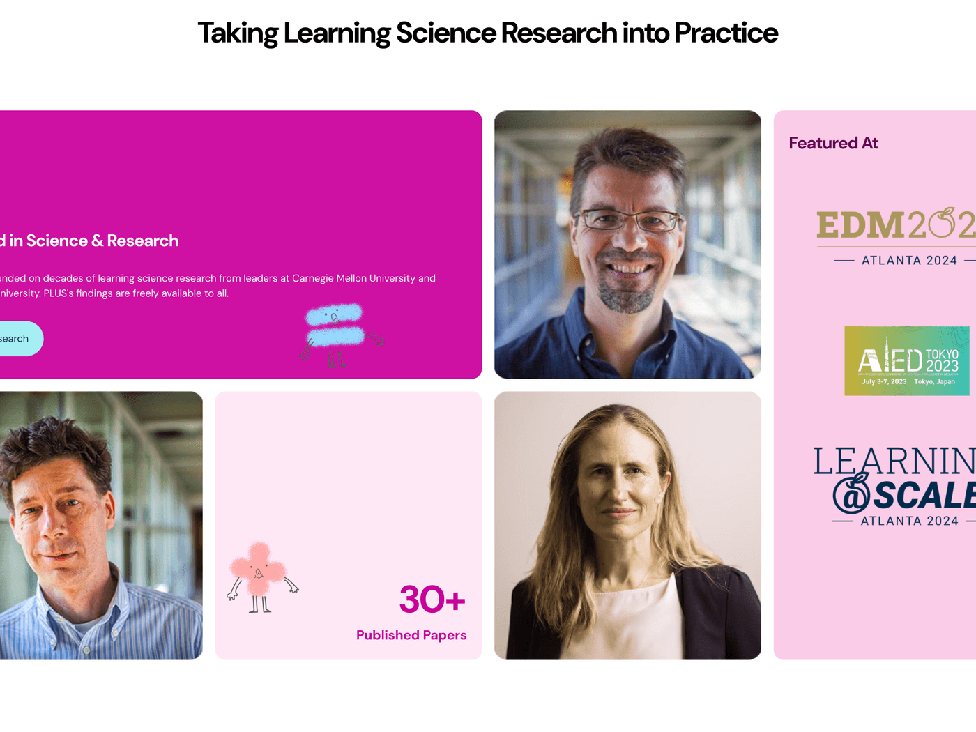
30+ papers, near the footer
The evidence gets top billing
Outcome
The site runs on one shared system: I maintain the technical foundation, while the PLUS team publishes content updates through Notion.
95%
average task success on the new site
up from 30% on the old site
11
routes shipped and live
0
deploys needed to publish
news, stories, team, and publications
Reflections
The hardest part was not the pages. It was building the system that makes the next page easy.
Takeaways
What I Learned
This project changed what I think website design is. It is not making one perfect homepage; it is deciding where the conversation splits, who each page is for, and what it has to prove.
Designing and building at the same time made me simplify: components I would have overdesigned in Figma got leaner the moment I had to implement and document them.
The CMS turned out to be a UX problem too. The visitor is one audience; the teammate publishing next month's news is another. Designing the editor's experience is what makes the site survive after launch.
What Comes Next
- Watch how each audience actually moves through its page, and let the pages evolve
- Grow the catalog of documented sections as new campaigns need them
- Integrate the tutor help center, previously a standalone Notion page, into the main website experience