
Bumble Pulse
Overview
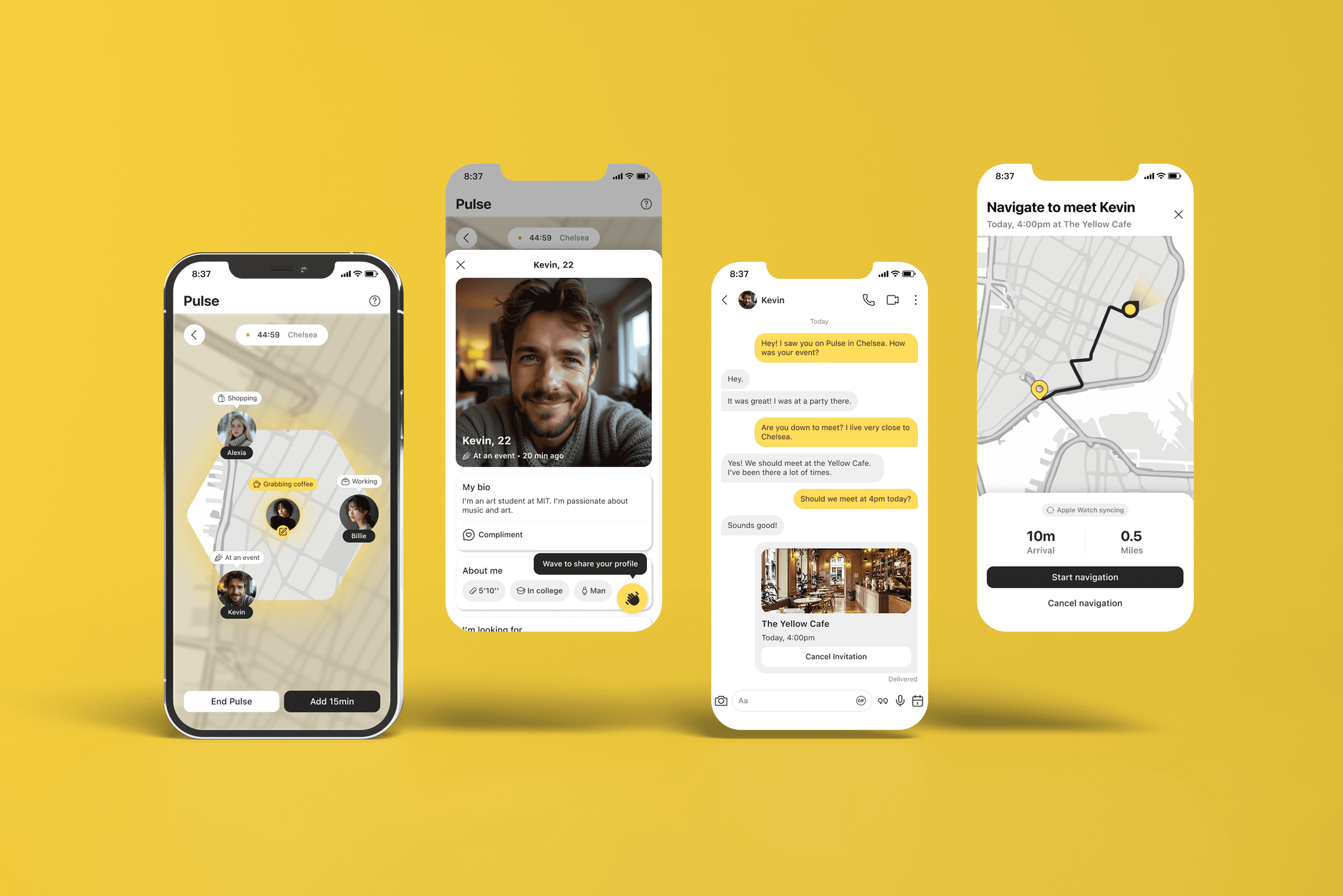
Bumble Pulse is a feature concept for Bumble that bridges digital matches to real-world meetups. Users opt into a 45-minute neighborhood window, see which matches are checked in nearby right now, and meet up spontaneously.
It is a solo end-to-end project: two weeks living in the app, eight user interviews, flows and hi-fi UI for mobile and watchOS, and a six-participant usability round.
Role
Product Designer
Responsibilities
Research, wireframing, hi-fi UI for mobile and watchOS, usability testing, motion specs
Tools
Figma
Timeline
Jan to Mar 2026
The Problem
A match signals interest. It says nothing about intent to meet.
Background
Bumble is a dating app where women message first. Its core loop (get a match and message) rarely leads to actual dates. I used Bumble for two weeks before starting: the moment I suggested a meetup, the chat died. The interest was mutual; the ask was just too big a first step. Making that step smaller became the brief.


70%
of matches stall before plans happen
26%
average message response rate
2–5
messages before the conversation dies
The Solution
The fix isn't a better chat. It's a reason to put the phone down.






User Research
Eight interviews with dating-app users kept pointing at the same four frictions between match and meetup.
Who I Designed For
Two types surfaced consistently: someone already out wanting to act on a nearby match, and someone chat-fatigued who just wants to show up. Jordan and Maya represent both.

Jordan Park
I’m always out on weekends but never know if any of my matches are actually nearby.
I have 40+ matches but I’ve never actually met anyone. Texting just exhausts me.

Maya Chen
Four Frictions, Four Answers
Semi-structured interviews, 45 to 60 minutes each · n = 8
Gender
5 women · 3 men
Age
3 22-27 · 4 28-34 · 1 35+
Primary Goal
5 relationship · 2 casual / open · 1 figuring it out
Where They Live
6 urban core · 2 suburban
Match made
A mutual like: potential is there.
Pulse changes this
Check in. Wave. Show up.
1. No spatial contextraised by 7 of 8
Pulse shows who's opt-in nearby, right now, not forever tracking.
2. The ask feels heavyraised by 6 of 8
A wave is a low-stakes ping instead of a formal coffee proposal.
3. Stuck in endless chatraised by 6 of 8
A 45-minute session makes the window real, closer to bumping into someone.
4. Premium feels thinraised by 5 of 8
Longer sessions + visibility give paid users a tangible real-world edge.
The Landscape
No app has connected real-time proximity with intentional meetups.
App
Privacy
Meet Intent
Meetup Rate
Notes
Relationship-first and high intent. Entirely in-app with no mechanism to close the gap to a real meetup.
Volume-based swiping. No live location or structure to drive real-world meetups.
Highest real-world conversion in the space. Distance always visible with no opt-in or safety controls.
Opt-in neighborhood check-ins. 45-minute sessions bridge digital matches to real meetups without tracking.
Storyboard
One Saturday morning. 45 minutes from check-in to coffee.

Out on a Saturday morning
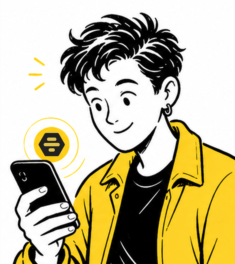
Checks into Pulse for 45 minutes
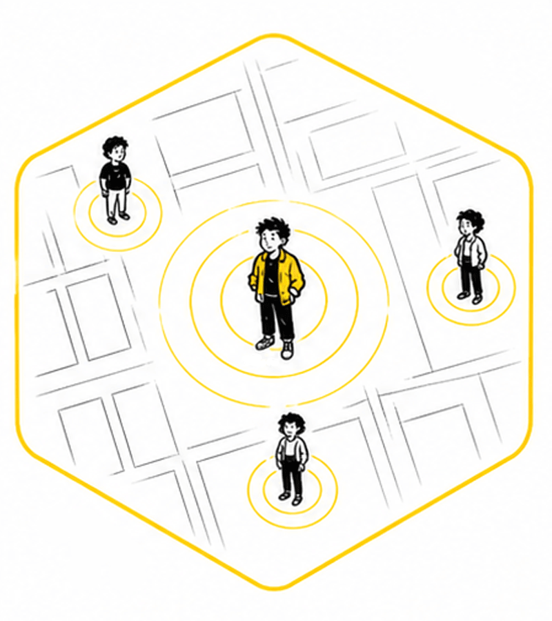
3 people nearby on the map
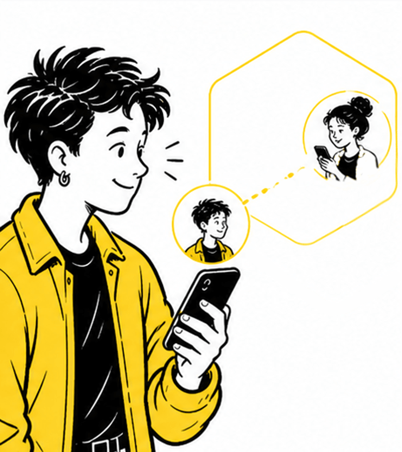
One is a match, already nearby
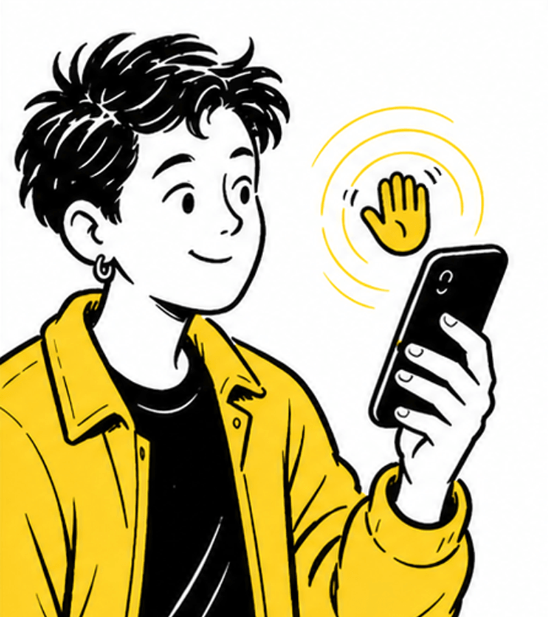
Sends a wave

A little later, they meet at the café
Usability Testing
6 participants, 3 tasks, 2 key iterations.
The Sessions
Figma clickthrough sessions. Participants tapped the real map flow while I logged errors, hesitations, and time-on-task.
Check-in
6/6
18 sec avg
Wave
5/6
Unaided
Meet Invite
4/6
No errors
Participants moved through the same path in session: opt in on the map, signal interest with a wave, then send a meet invite.
After each task, participants rated ease from 1 (very difficult) to 5 (very easy). Averaged across all six sessions.
Iteration
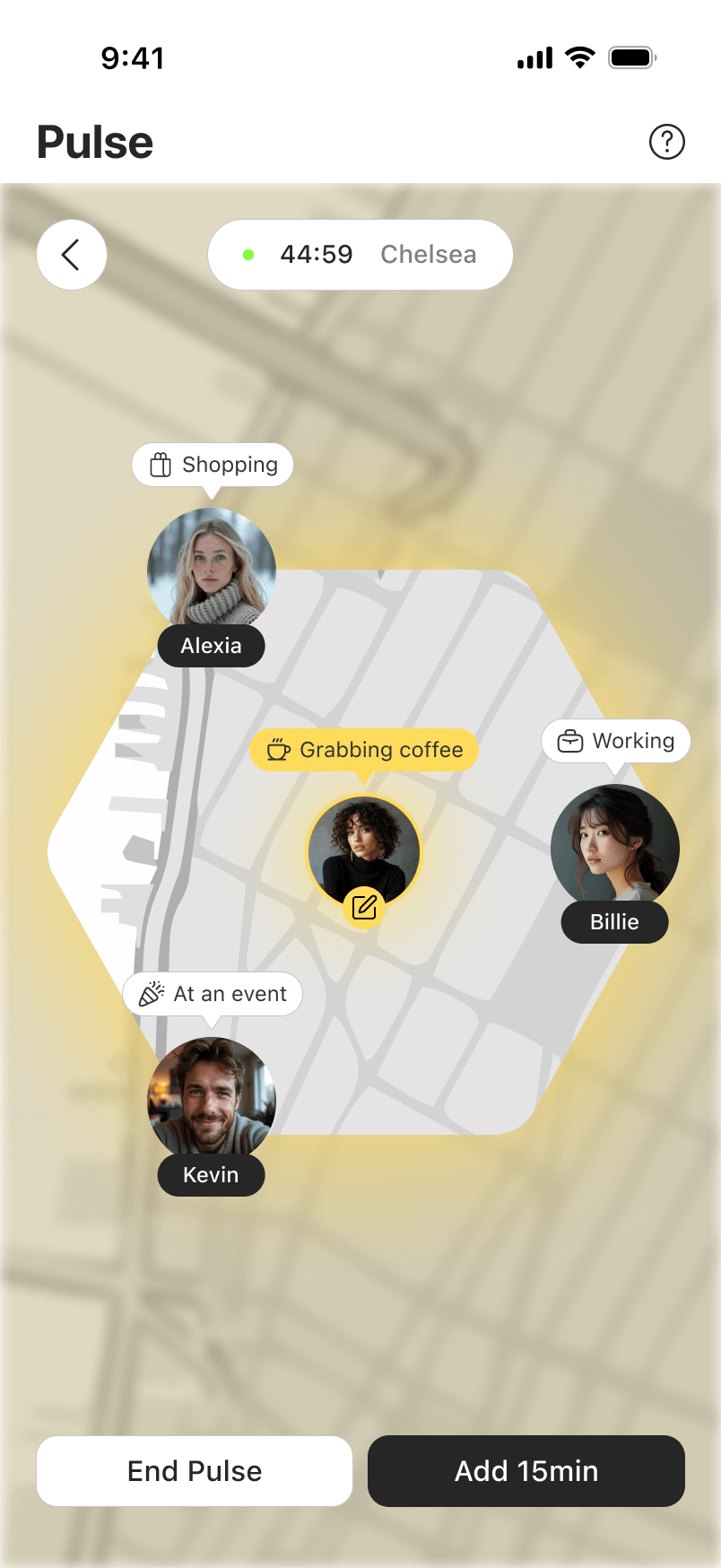
Profile Visibility
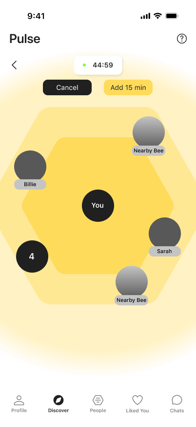
Blurred
Visible
Meet Spot Selection
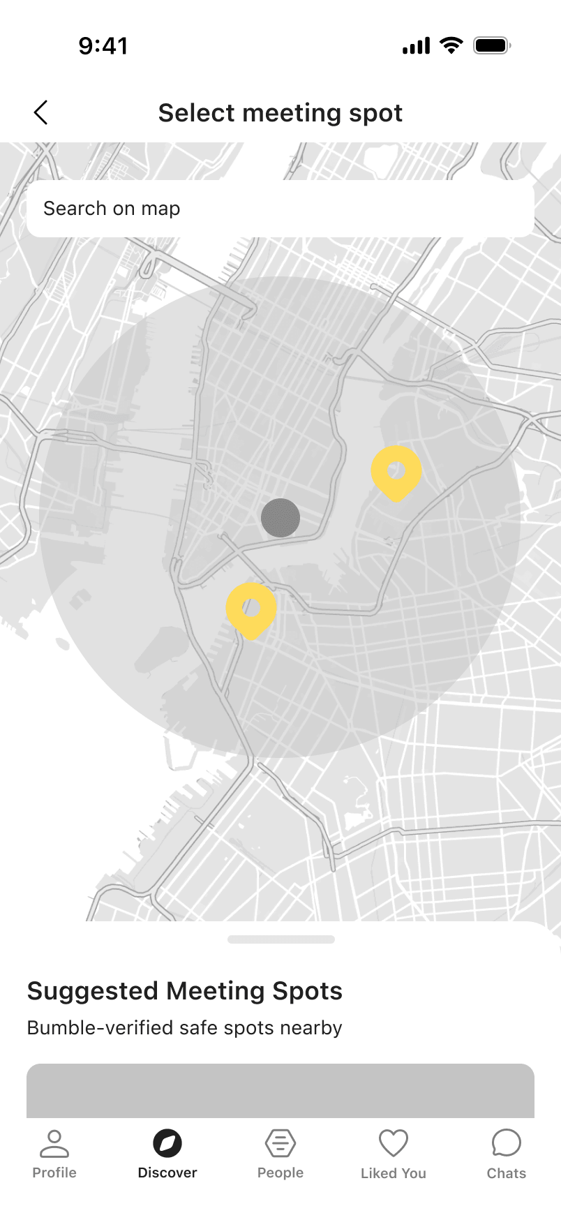
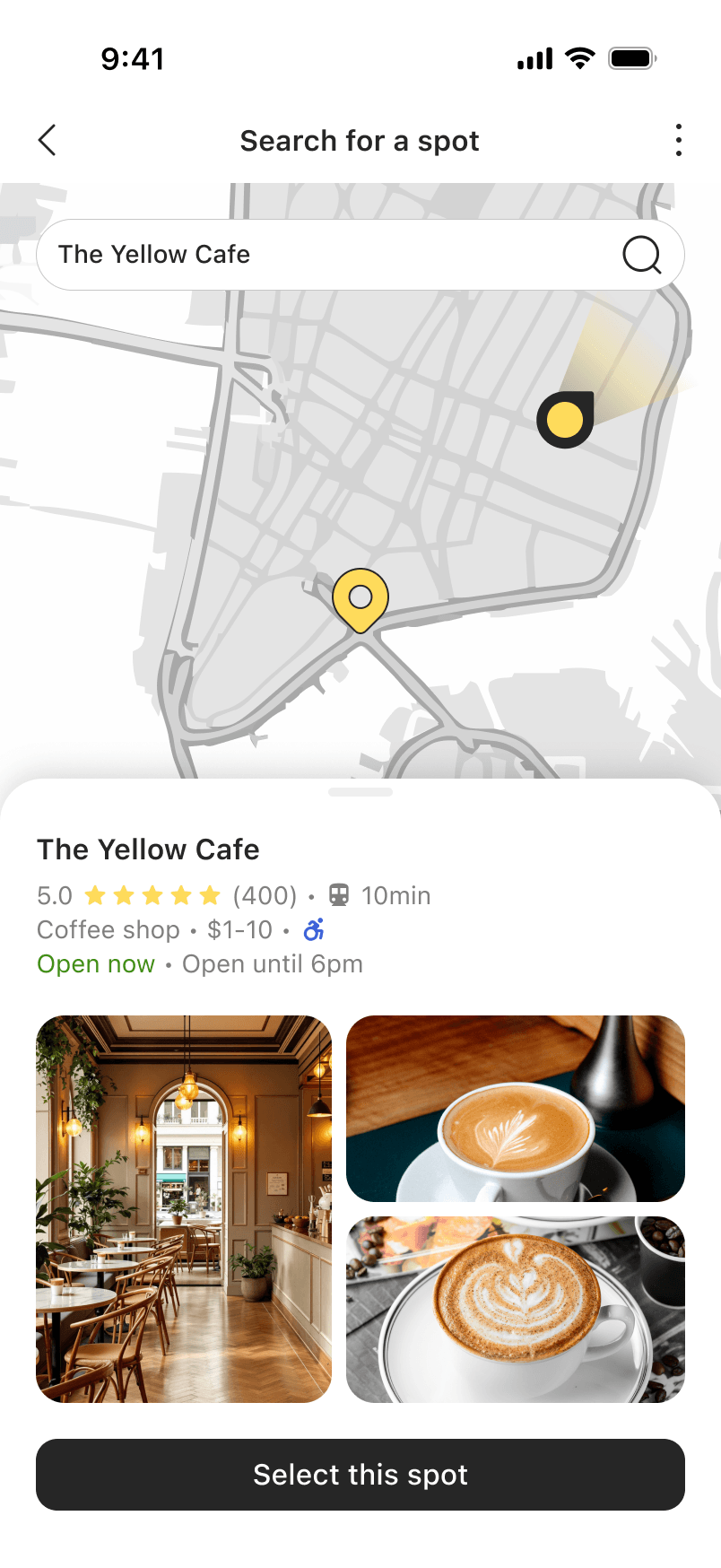
Suggested venues
User search
Early wireframes blurred nearby profiles for privacy. Testing backfired: users wouldn't wave at someone they couldn't see. Since Pulse is already opt-in, the blur only added friction. Profiles are now visible.
The original flow suggested nearby venues as meet spots. Recommending specific businesses risks implying endorsements, a commercial grey area. Replaced with free location search so users pick any spot on their terms.
Final Product
Digital matches to real-world meetups: check in, see who's nearby, wave, show up.
Check In
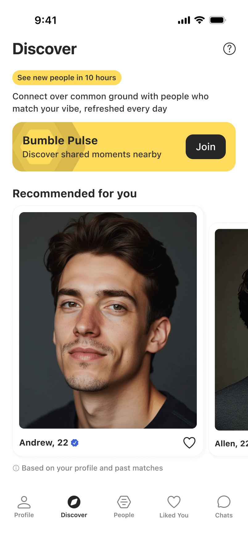
Pulse in Discover tab
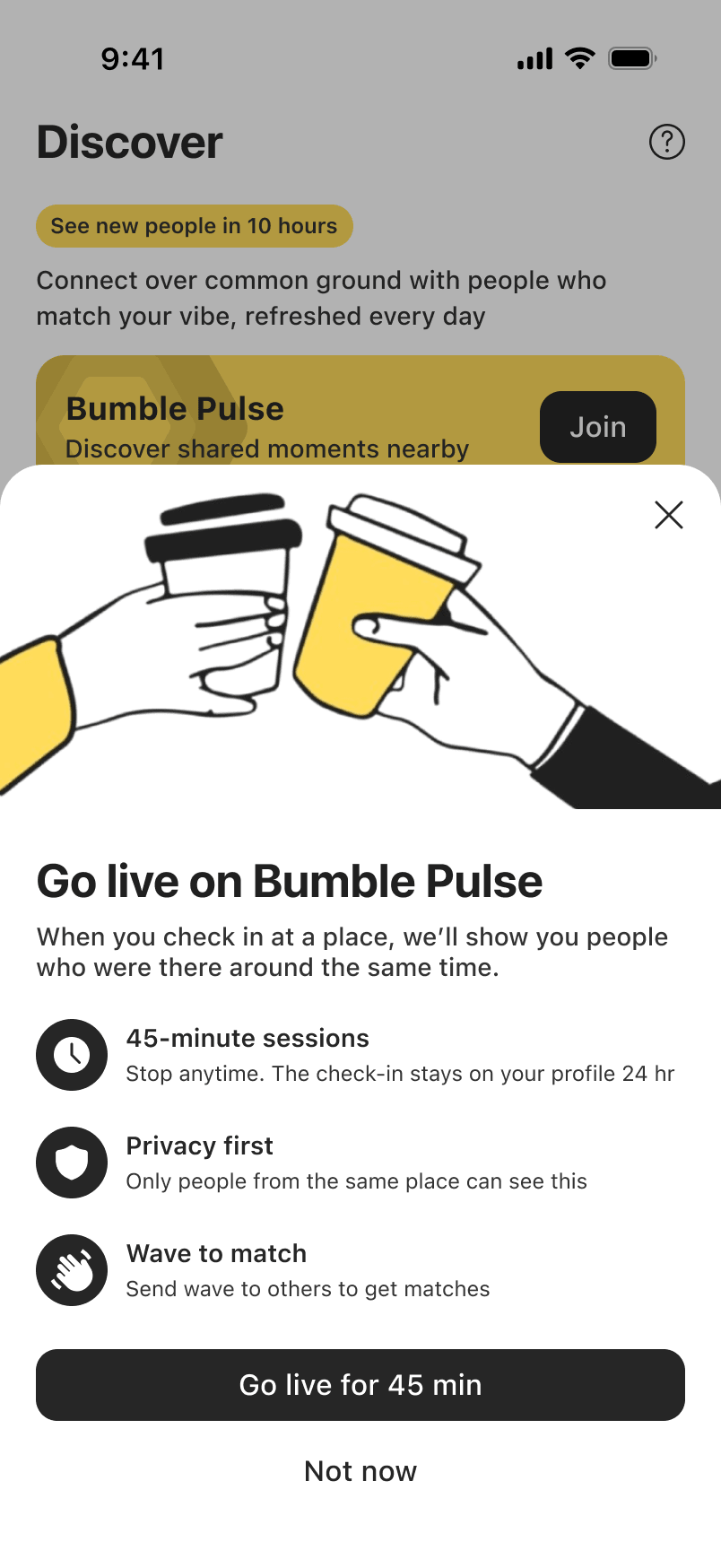
Check-in instructions
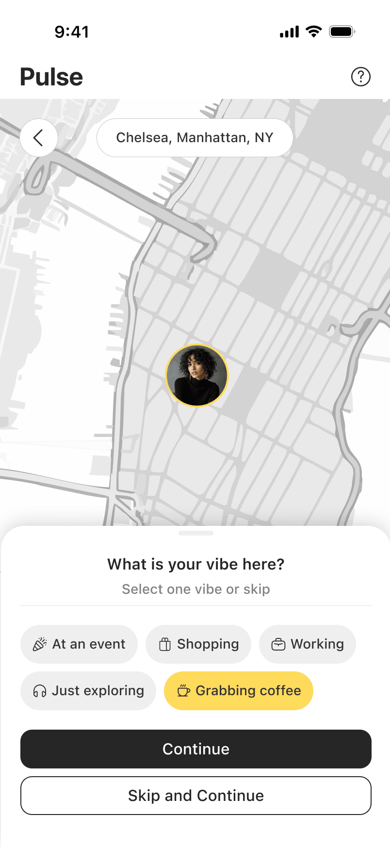
Pick vibe shown to others
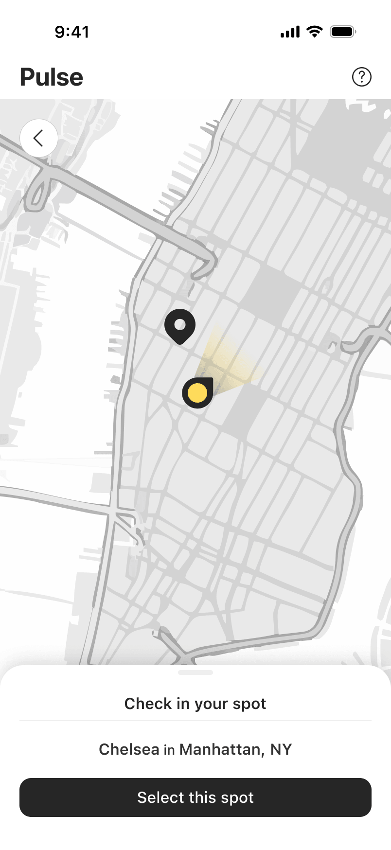
Go live on map for 45 min
See Who's Nearby
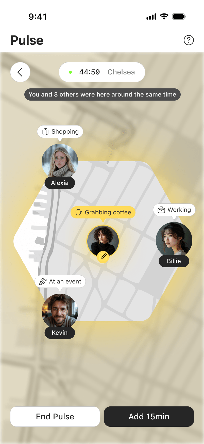
Nearby check-ins on live map
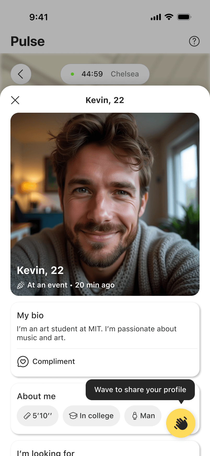
View their profile
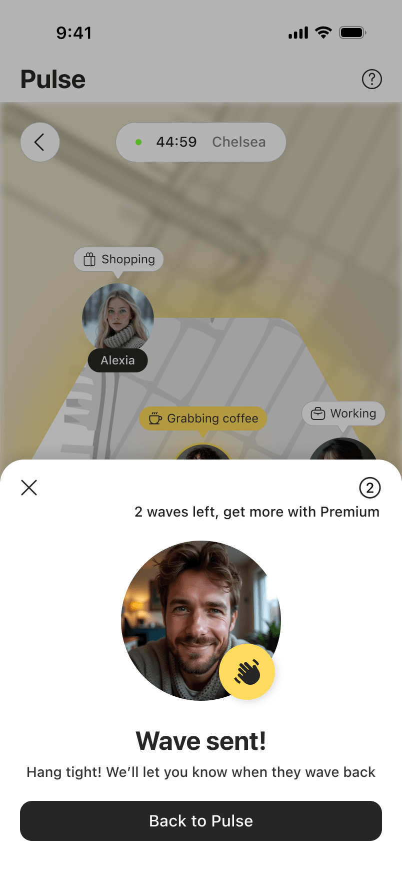
Send a wave to meet
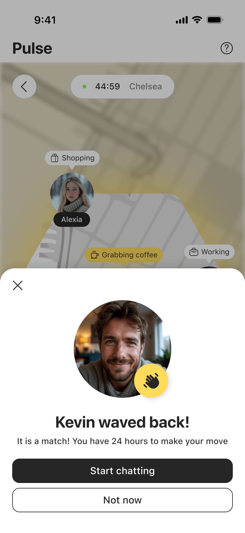
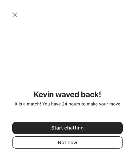
They waved back
Waves Surface in Liked You
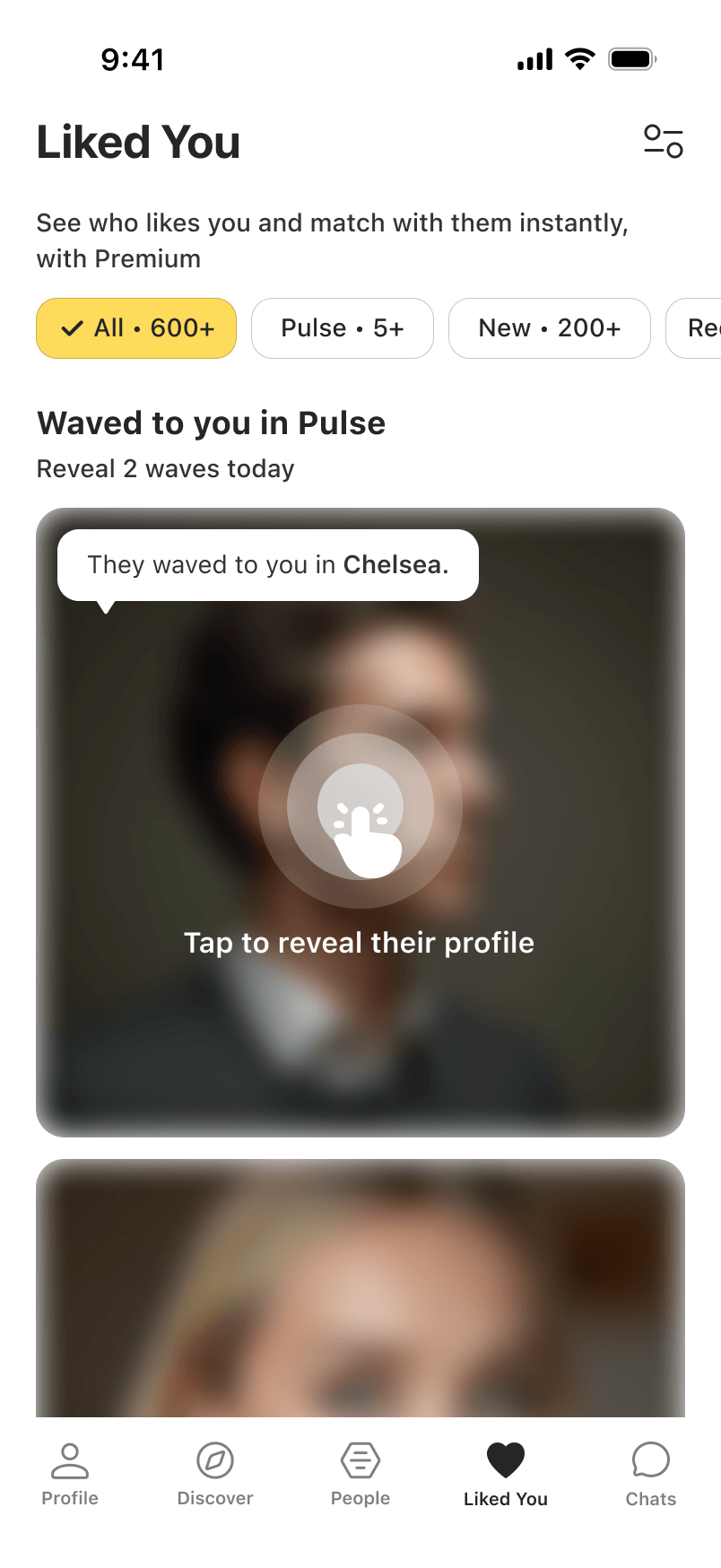
Wave received in Liked You tab
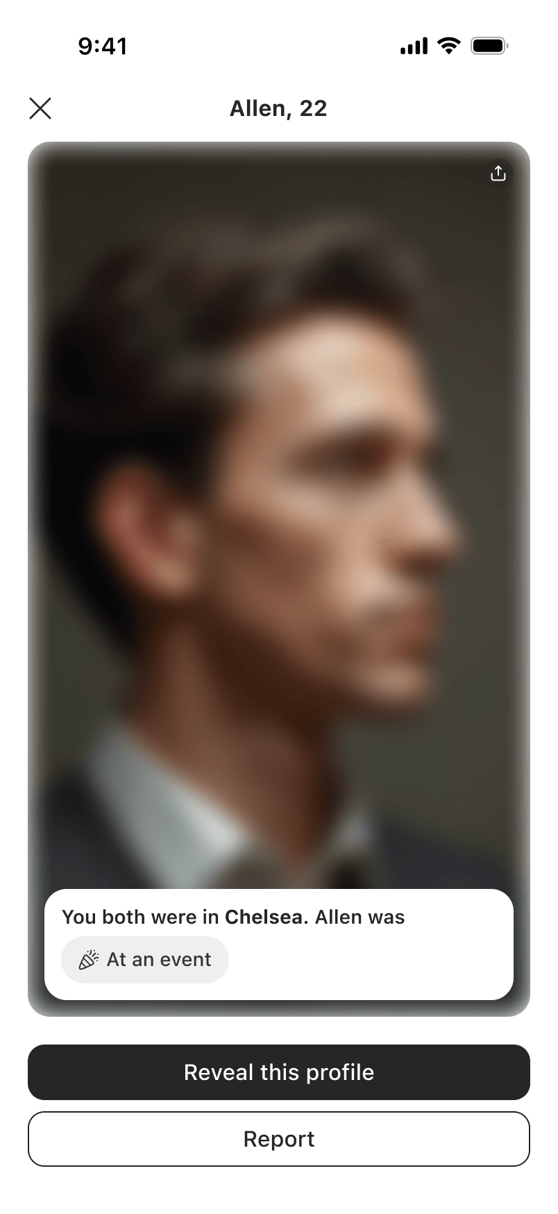
Tap to reveal who waved
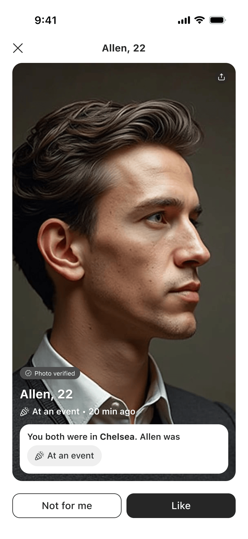
Like or pass
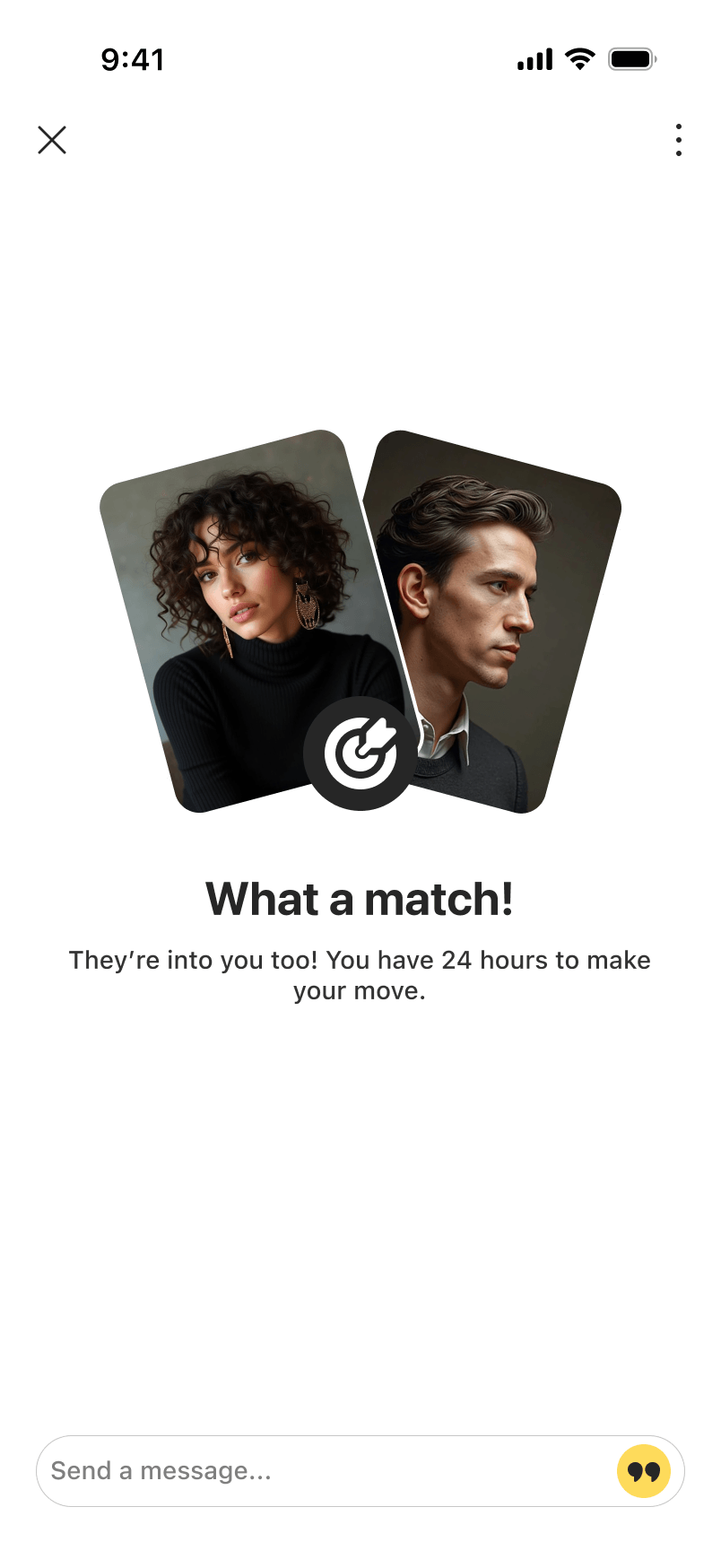
It's a match
Meet Invitation
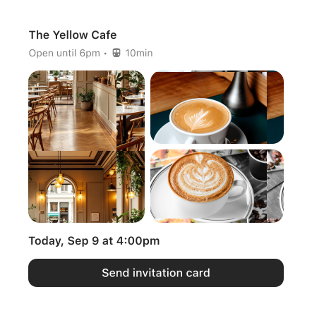
Search and pick a spot
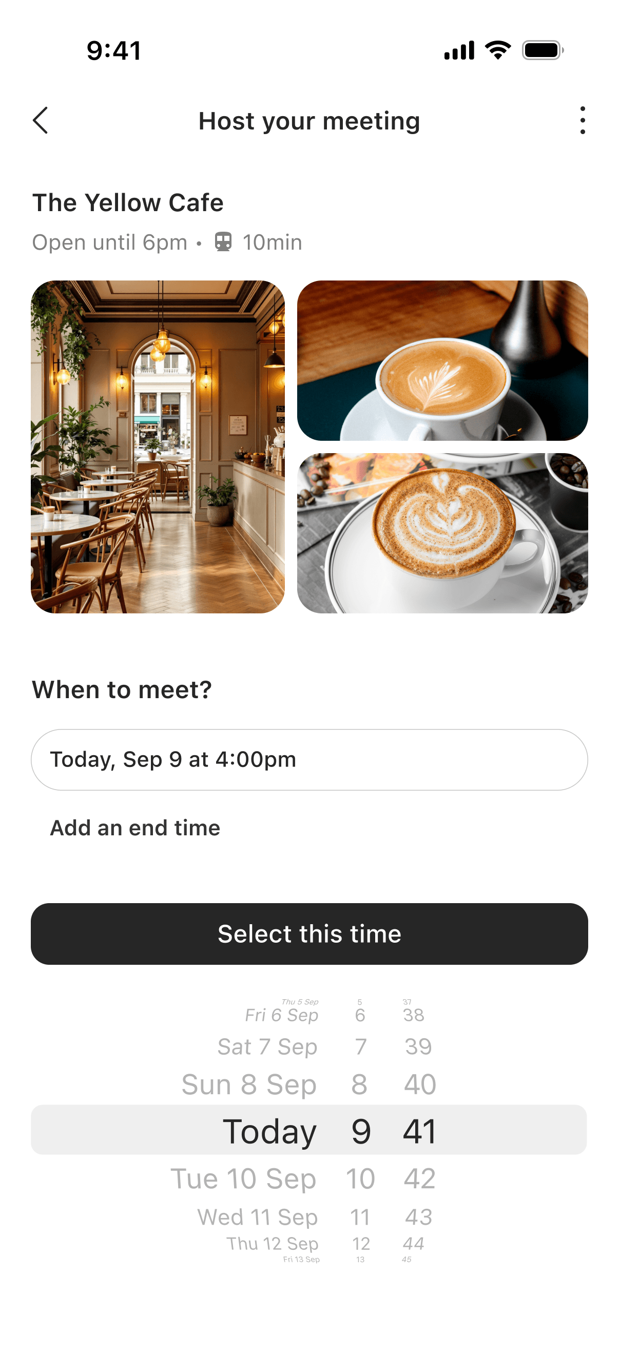
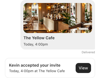
Select a time and confirm
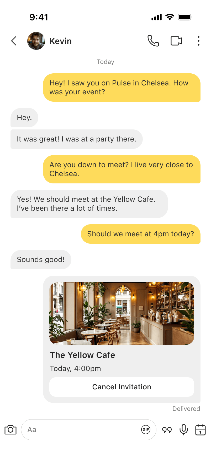
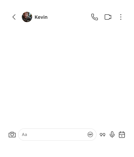
Invite lands in chat
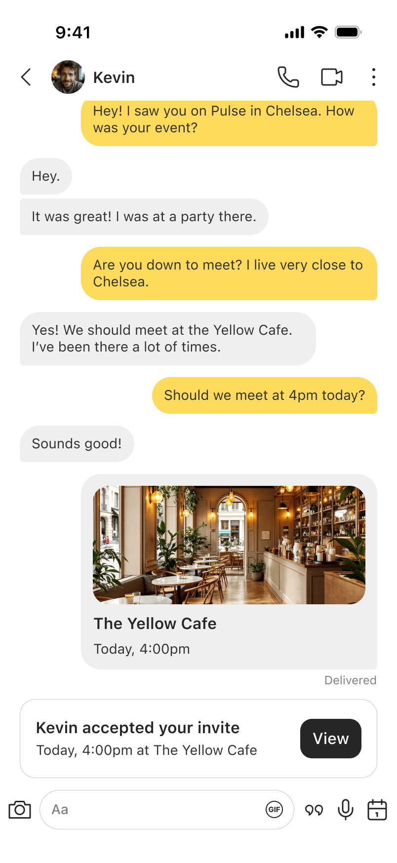
They accepted
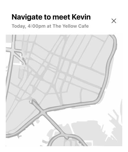
Navigate to Spot
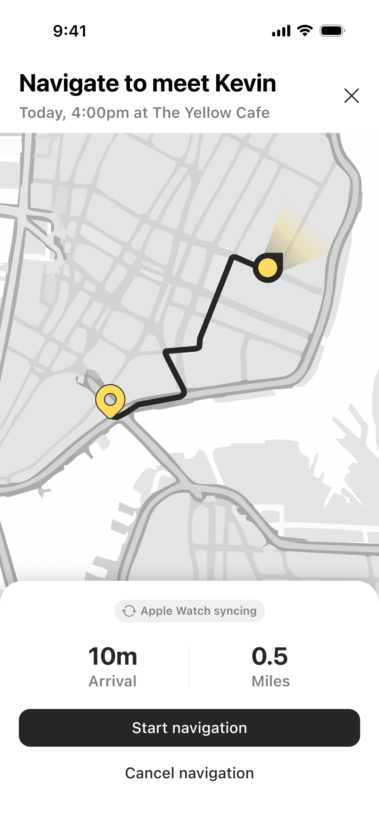
Open navigation on mobile
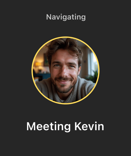
Syncs to watch
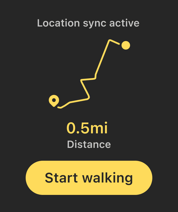
Route overview
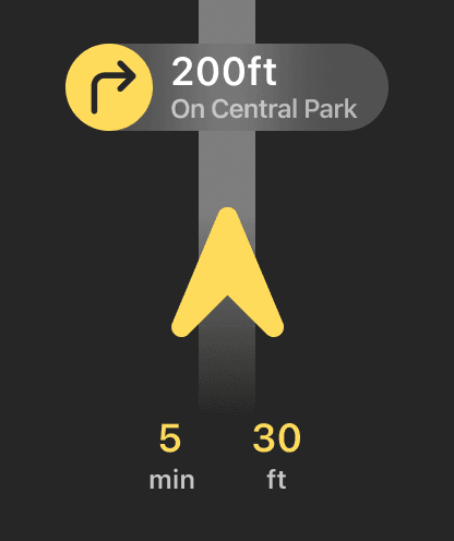
Turn-by-turn
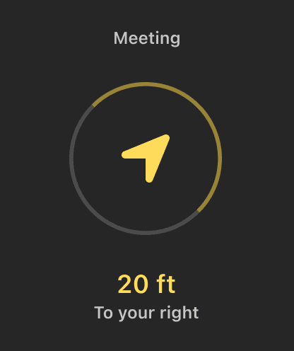
20ft away
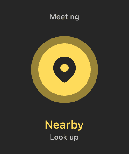
Arrived
Did You Meet?
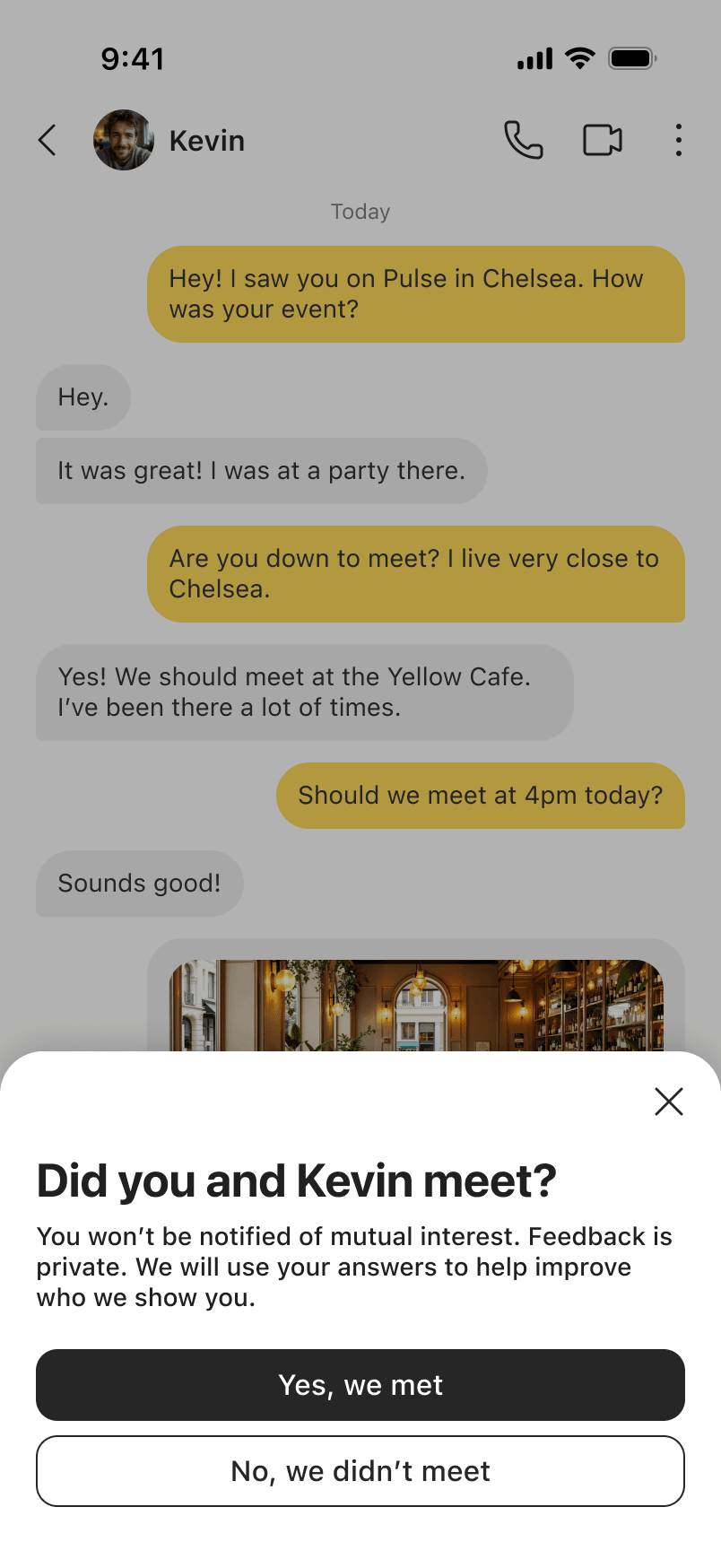
Post-session check-in prompt
The Upgrade Moment
Free users get 3 waves per session. Reaching the limit surfaces an upgrade prompt. Premium removes the cap and adds extensions.
Free
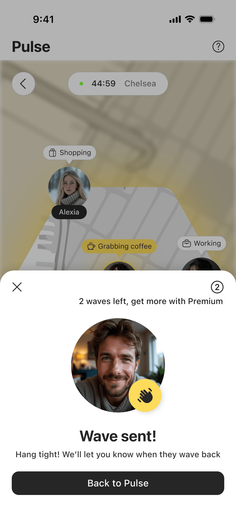
3 waves per session
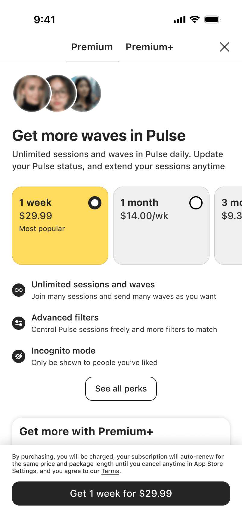
Go Premium for more
VS
Premium
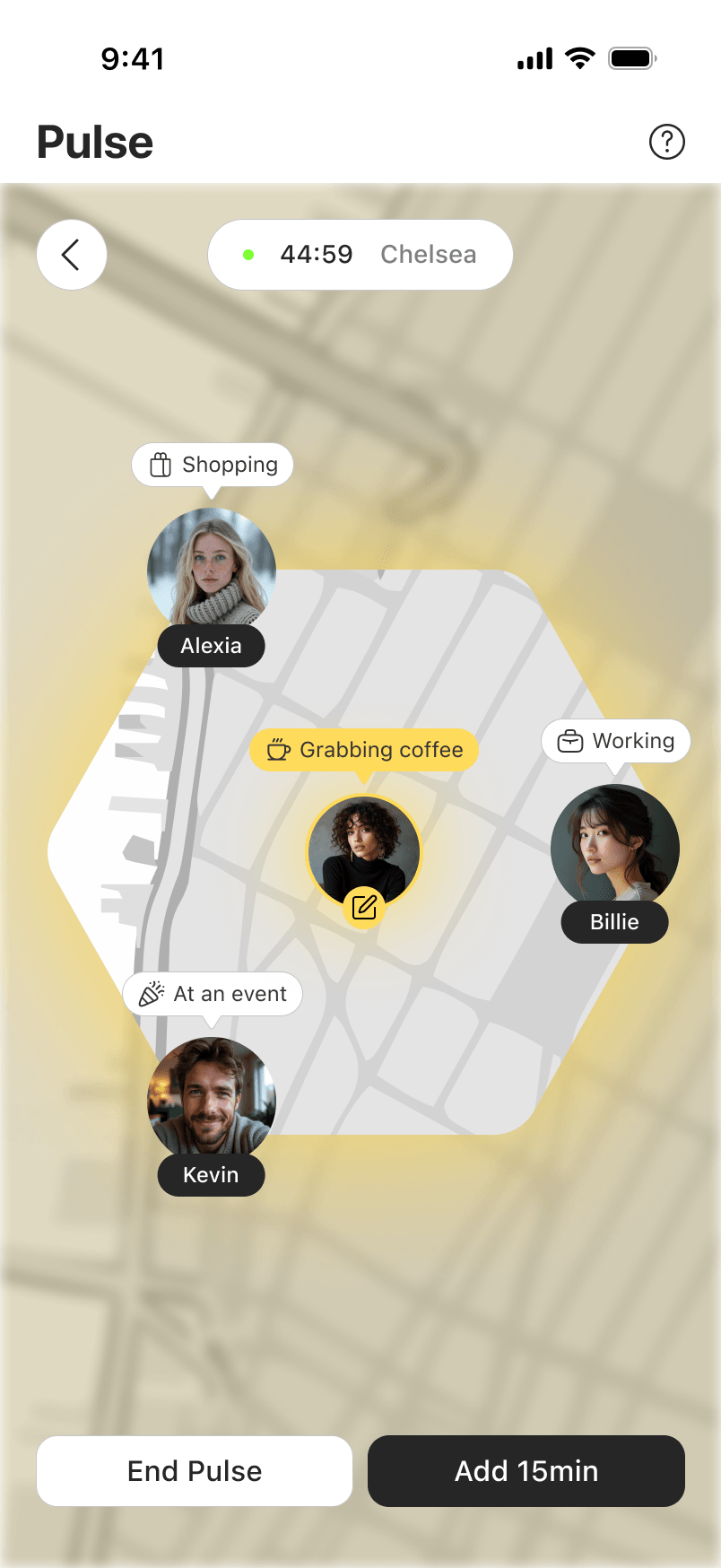
45-min session
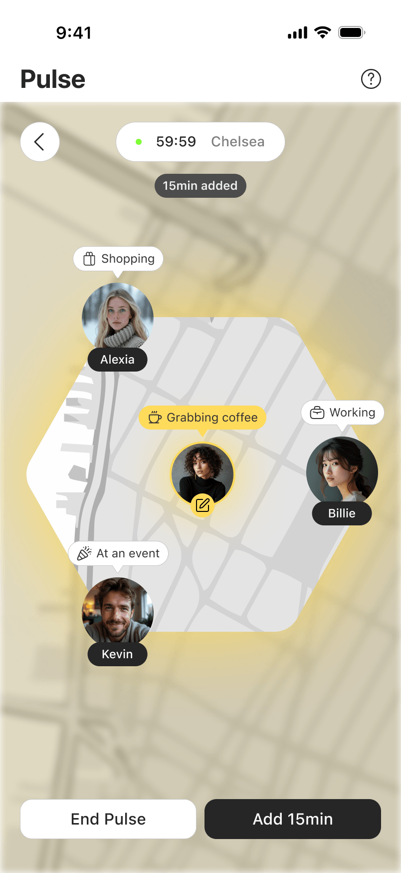
Extend anytime
Reflections
The hardest problem wasn't the UI. It was perceived social risk.
Takeaways
What I Learned
Every decision (anonymous neighborhoods, time limits, the wave) served one goal: make the first step small enough to take.
People don't need a better chat interface. They need a reason to put it down. Timing, proximity, and social context aren't features; they're the whole point.
What Comes Next
- Live pilot in SF or NYC with a premium cohort
- A/B test 30 vs. 60 min session length
- "Pulse History" to reconnect with people you crossed